I started a micro blog at mjdescy.micro.blog this week. It is not to replace this blog, but to supplement it with a more frequently updated stream of short comments and asides about my life, or about news items that directly affect my life in some way. I want it to be like Twitter was for me back when I first joined it: a stream of consciousness, and a window into my life. My plan is to keep this blog (my macro-blog?) free of micro blog posts and life blogging, and more focused on longer articles, bigger ideas, and more complete thoughts—as it has been from the very start.
I spent some time this evening starting to code something new for work in C#: a tool for comparing actual drug formularies to required ones. It should be a fun little project.
Twitter is abuzz about UIKit, perhaps, going to the Mac late next year. We’ll see. I would love to code a new version of my todo.txt app, SwiftoDo Desktop, in UIKit rather than AppKit. The different table view model is a big factor in that, though UIKit’s window and split view controls are, of course, different, too. WWDC will be especially interesting next year.
It’s the last work week of the year, and the busiest I’ve had in about six months. I had to work late tonight. (I’m still working, in fact.) It’s making me think of this bleak article I read earlier this evening: eand.co/what-do-y…
Drafts for iOS
Drafts is a tinkerer’s DIY dream of a text editor. It nails the basics, and allows you to customize its editor and its tag and folder system to fit your specific needs—it just takes a little time (and, maybe, some JavaScript skills, for some things) to do so.
Drafts is where text begins
Drafts, by Agile Tortoise, isn’t exactly an unknown app. On the contrary, it is one of the crown jewels of the iOS platform. It is one of the few apps with an in-app purchase tip jar that I actually threw money in—a few times, actually. Drafts makes my life simpler, in little ways, every day. Like one of my other favorite writing apps, Ulysses, it is a pleasure to use.
Drafts is primarily meant for quick text entry, and then pushing that text to another app for processing or storage. For example, I type most calendar entries and Google searches in Drafts (which is in my home screen toolbar) and, in two taps, open them for processing in Fantastical or Safari (which are not in my toolbar). Drafts 4, which has been out quite a while now, expands on that basic idea, and delivers a very useful utility and a top-notch text editor.
Not just for automation—for writing!
Drafts is already well known for its automation capabilities. It is great for drafting a tweet and posting it to Twitter (either natively or via another app), or for writing out a calendar entry and pushing it to Fantastical or Calendars 5 for parsing. What it is not well known for—but should be—is that it is the most customizable text editor on iOS. Editorial has long held that crown, thanks to its its support of snippets and extensibility with Python scripts. Drafts, however, outdoes Editorial when it comes to customizing the editor itself, which has a profound effect on writing experience.
In Drafts, actions can change the text your are writing, send some or all of it to another app, turn on/off night mode within the app, and so on. You can download actions from the developer’s extensive library, of, if you are a bit of a programmer, you can them yourself in JavaScript, from within the app. You can assign these actions to the main menu, which is accessible from the top-right icon, or from a swipe to the left. That’s the basic stuff. You can also assign these actions to a custom toolbar that is displayed over the keyboard. Even better, for hardware keyboard users, you can assign your own hardware keyboard shortcuts to these actions, too. No other iOS app that I use does this!
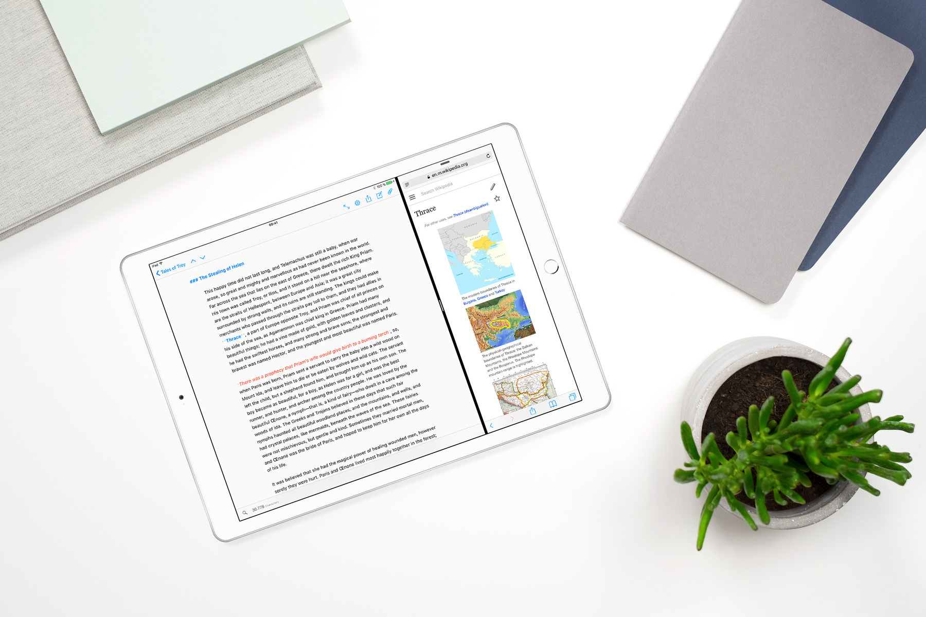
I use Drafts on my iPad primarily for writing notes, such as when I get a phone call or am in a meeting. I use my custom toolbar buttons to input today’s date, paste text, format headings and lists in Markdown, send various lines (text selections) to my todo.txt file (via Dropbox), and so on. At the end of my writing session, I send the entire note to Dropbox for storage.
Notes don’t have to be exported, however. They can stay in Drafts and sync to all your other iOS devices via iCloud. You can also organize them there. There are three basic folders—Inbox, Archive, and Trash—to put notes into. You can flag notes for future retrieval, and filter them them by folder, flag status, and keywords (search terms within the note text) into custom “folders” or saved searches as well. I have not switched over to using Drafts as a full-fledged notes app (most of my drafts get automatically deleted after 30 days in the Trash folder), but I am thinking about it.
Drafts in the future
Drafts 4 has been around for a while now. Drafts 5 is coming, someday, with even more features: TaskPaper editing is a feature that I am looking forward to. I expect the pricing model to change from paid upfront to a subscription; I will be happy to pay for it, as a valuable companion to Ulysses for writing, and a valuable sidekick to practically every other app in the iOS ecosystem.
What I want is Twitter that isn’t Twitter
I love Twitter. So much information and commentary is shared there, so quickly, that it is a vital source for “what is going on on the Internet today”. At the same time, I hate Twitter, for all the bad behavior performed on the platform that Twitter, the company, tolerates. I’m not alone. A lot of people I follow feel the same way. I see tweets like this almost every day:
Brad DeLong: “I wish there was a network like twitter, but not, you know, actually Twitter”
The folks at @twitter are spineless cowards.
I wish there was a network like twitter, but not, you know, actually twitterThe thing is, practically since Twitter’s inception, alternatives did exist. I know. I used them: Identi.ca, StatusNet (the successor to Identi.ca), Pump.io (the successor to StatusNet), and App.net (a for-fee Twitter that got a lot of press but not so many users). And, I abandoned them and went back to Twitter, despite its flaws. So did everybody else.— Dave DeLong (@davedelong) November 30, 2017
Why is Twitter so sticky, and nothing else is?
What makes Twitter is valuable not what it does—microblogging is relatively easy to implement these days—but who is on it: Famous people! Intellectuals! Politicians! Journalists! These people and many more are not only publishing there, but reading there, too. Communication with, and between, influential people there can be two-way, and is usually in public, which is fascinating to read and unlike any other communications platform that had come before it. Twitter can amplify the voice of the non-famous and non-published people, too—the under-represented—which is often great.Why is Twitter described as a cesspool?
Sometimes, though, amplifying under-represented voices is not great. Some voices are under-represented because they are malicious: Racists! Nazis! Liars! Sexist doxxers! Spammers! Russian bots! Malicious people have unique incentives to exploit and abuse a communications platform like Twitter. First, simply having a medium and a platform to spread their message is unique to them, because these people have been barred or banned elsewhere from spreading their message. Second, access to this new platform may be fleeting, because they could be banned there, too, for the same reasons they have been banned elsewhere. Third, people who want to spread malice are not the type of people who are concerned with preserving the health of the platform’s community, or the platform’s reputation in the wider world. Therefore, they can destroy the platform in the process of spreading their message.Why can’t Twitter fix this?
The world is too complex to separate people, or Twitter users, into good and bad actors. What is unpopular or under-represented today may be celebrated tomorrow; it may be true and worth spreading today. Understandably, Twitter doesn’t want to choose who gets to speak on their platform. Therefore, they tolerate hate speech on their platform to a degree that makes some of their users angry. It puts the company in a difficult position when hate speech is broadcast (retweeted) by the President of the United States, as it was this week.I understand Twitter’s problems as a company. It needs eyeballs on it to sell ads. Controversy on the platform, and the sheer number of active users (whether they are real people or bots), lead to greater traffic, greater revenue, and greater return on investment for their investors—at least in the short run. In the long run, however, poisonous speech on the platform poisons the platform.
What to do about it, as a Twitter user?
Basically, it is hard to see how, as users, we can improve Twitter. Twitter, the company, owns the platform. Consequently, it has the sole power to fix its flaws. Improvements to blocking and reporting abuse that Twitter has implemented have not satisfied the users who need them the most.Moving away from Twitter entirely, onto another, similar platform, can work for small communities who primarily wish to communicate amongst themselves. It is unlikely, however, that a critical mass of influential users—the celebrities, journalists, etc., who make the platform valuable—will move to a different platform at this point. Without those users, another platform, however superior from a technical or community management standpoint, would not have as much value.
As a Twitter user, you really have two choices now: live with the abusive users, and report and block them as well as you can; or, if Twitter abuse is bothering you enough (or worse, threatening to your safety), stop using Twitter entirely. That is a sad conclusion to make, but I think it is realistic. Twitter’s ad-based model, need to generate both traffic and return on investment to satisfy its shareholders are, in the short run, at odds with its stated goal to improve safety, and therefore community, on its platform.
Fortunately, there are other ways to write content on the internet for free, such as WordPress. The problem is, you may never achieve the same reach with these other platforms as you would with Twitter. That is why I am sticking with Twitter myself. From a moralistic point of view, I would love to ditch it for something else. Despite that feeling, I get enough value from Twitter to keep using it, despite the sick-to-my-stomach feeling the Twitterverse gives me some days.
Ghost, a leaner, faster, WordPress alternative
I learned about the Ghost blogging platform today. It looks awesome, especially with its simplified feature set (just what I need, nothing else), strict adherence to Markdown for writing, well-designed multi-platform front-end applications, and so on.
Mostly, Ghost’s speed impresses me. I hate how slow WordPress (the software that powers this blog) is compared to, say, a static website or a Jeckyll blog. I love fast-loading websites, and went out of my way to create static sites for 1000umbrellas.com and plaintext-productivity.net for that very reason.
Unfortunately, I doubt I will ever use Ghost. I am very dedicated to Ulysses as a writing tool, and Ulysses does not publish directly to Ghost. It publishes directly to WordPress, which is the main reason why I use WordPress. (Sure, there are workarounds for publishing from Ulysses to Ghost, but nothing beats a one-step solution.) WordPress is also ubiquitous, making it very cheap and easy to self-host.
I could pay more for faster WordPress hosting, but, considering how few readers I have, I can’t justify the additional expense. So, for the foreseeable future, I will enjoy easy publishing to WordPress via Ulysses, extremely cheap hosting expenses, and my readers will have to wait a second or two for my blog to load. I hope nobody else minds.
Back to RSS and the Indie Web
At the end of last year, I quit using RSS. It was a big step for me. I had been using RSS practically since it first became available. My first RSS reader was the Sage plugin for FireFox, which I started using in 2004. I subscribed to Slate, LifeHacker, a couple other professional publications, and a fairly large number of personal blogs, covering topics ranging from technology, economics, and personal finance to cooking and television shows. I was obsessive about skimming my feed many times a day, reading every headline, and often every article, of Slate and my favorite blogs.
I eventually dropped Sage for Google Reader, and used it, and later Feedly, as a back-end to whatever smartphone RSS reader I was using. For years I checked my feeds a dozen times a day, read a ton of articles (though not all of them, as I used to), and generally felt pretty happy with the experience.
Why I quit using RSS
I stuck with RSS long after I became a habitual Twitter user, long after I started to see articles linked to from Twitter before they hit my RSS reader, and long after most technology writers and podcasters started disparaging RSS as some antiquated technology that, like dial-up internet service, was hopelessly out of date.Eventually, though, I quit using RSS—not because it was uncool, but because it was no longer making me happy. Like those writers and podcasters said, the basic need RSS fulfilled for me—keeping current, and entertained with fresh reading material—was being fulfilled by other services. Twitter did so more timely, and with more commentary from the writers. News aggregators, such as Apple News, did so with a slicker visual style. (I am emphatically not a regular Facebook user, so I miss out on whatever is going on there.)
I thought these services were more hip, modern, and fun than RSS. Most importantly, I thought they were keeping me more current. After all, for a long time, my RSS reader (the wonderful Reeder app for iOS) fed me the same articles that I had already seen on Twitter. Worse, it fed me five or six different publications’ takes on the same subject every day, which was interesting a few days of the year (such as when reviews of new Apple devices hit the streets), but was otherwise completely redundant.
What I missed without RSS
After a year RSS-free, I started to think something was missing. I was literally missing articles that I would like to read, especially those from bloggers I liked, such as Erica Sadun and John Gruber, because they would pass by in the timeline before I would see them. I was missing bloggers’ voices in general, because most of my Twitter list (like everybody’s, I’m sure) is heavily news related. I could keep up with what the New York Times and Washington Post are publishing each day pretty well; but what about what Manton Reece and Tyler Cowlin are publishing? Their voices were being buried in my Twitter feed by the daily (hourly?) news cycle.Without RSS, I missed the spirit of the independent web: all those individuals and small publications who are sharing knowledge and expressing opinions that don’t fit into 140 characters, or even 280.
Back to RSS (and Atom, and JSON Feed)
After many months away from it, I realized that RSS wasn’t the problem—I was. I wasn’t using RSS in a way that made me happy. Worse, I supplanted it with Twitter, which both sucked up all my attention every day, and reduced my attention span for content to 140 characters (a length perfect for snipes and jabs and headlines, but insufficient for most cogent thoughts). Fortunately, RSS has not died since the rise of Twitter and Facebook. It has quietly remained a fundamental internet technology, undergirding nearly every online publishing platform. Many, many sites support it without advertising it the way they used to ten years ago. Luckily, any good client can find feeds using just the site URL.Not only RSS is still there: my longstanding RSS software is still there, too. Like in 2013, I am using Reeder on iOS as a front end, and Feedly as a back end. Reeder has been around almost as long as the App Store. It is rarely updated, but it just works. It’s simplicity, elegance, and stability make it one of the finest apps on the platform. Feedly, the back end service that actually checks my feeds, is a free service that I basically never look at. I don’t use their website. I don’t use their app. I don’t really know or care how they make money off of me. It, like Reeder, is solid, stable, and just works.
Using RSS with a different perspective
After returning to my RSS reader after such a long break, I had thousands of unread items and dozens of subscriptions. I decided to start over, so I unsubscribed to all my feeds, and started thinking about what I really wanted to get out of RSS, and, in general, out of the Internet.I decided to use RSS differently now. I no longer need it to drink the content firehose and keep current with the minute-by-minute news cycle; Twitter is available for that, for good or ill. Instead, RSS enables me to follow a few interesting voices on the Internet, read their actual, in-depth thoughts, and not miss anything they have to say.
To these ends, I no longer follow big media sites. Primarily, I follow blogs: real blogs, written by actual people, rather than published by massive organizations. I’m mostly following Apple-focused tech bloggers and Swift programmers, which reflects my favorite hobbies—but that’s just what I’m doing for now. Lastly, I’m not checking my RSS feeds a hundred times per day. I am checking only a one or two times per day, and often I don’t have any updates. Instead of adding more feeds, I just accept it now. Sometimes there’s nothing new to read, and that’s OK.
I’m happy with RSS again. All it took was figuring out what I really needed to get out of it, and taking control of how I used it. It’s a really great technology, no matter how passé or uncool it seems to be.
Ulysses, a peerless writing tool
I love Ulysses.
This post on the Ulysses blog illustrates its value proposition. It is a minimalistic plaintext editor. It eschews common word processing features (such as rich text formatting) and some high-end “writing app” features (storyboarding, a character name generator, etc.) in favor of a stark, clean interface and generalized organizational tools (a unified library of “sheets” that can be organized in folders or with keywords).
In a way, its lack of features is its greatest feature. It focuses on the text, both from a writing standpoint and a publishing standpoint. That’s what writers should do—and want to do (really!). But writing is hard work. It requires incredible focus, and achieving and maintaining that focus is really hard. Just about anything is easier than writing most of the time. That’s why writers, famously, procrastinate. Sometimes, though, writers get into a flow state, just like software developers do, and any distraction will break that flow. App-induced distractions are particularly unwelcome. The worst offenders, ironically, tend to be features that promise to help make your writing process easier—especially if those features don’t exactly gel with what you are doing.
Ulysses gets that. Its feature set is intentionally uncomplicated and applicable to a broad base of writers. It hides some of its most powerful functionality, such as its awesome publishing features, until you actually need it. It doesn’t impose any system, workflow, or rules on you. Its simple system of sheets, folders, and keywords allows you to build your own organizational system that is specific to your projects—or, alternatively, to ignore organization until you absolutely need it. Most importantly, it puts the focus on the text, right where it needs to be.
Interesting Updates to the Essential Phone
The Essential Phone has been making some interesting moves in the market lately.
- Essential dropped its asking price by $200.
- Essential released their second monthly software update, which improved performance (smoother scrolling! faster camera app!) and added some gesture support to the fingerprint sensor on the back.
- Essential is releasing new colors, starting with Pure White, which looks really good.
It has had a reputation amongst tech writers and podcasters as a market failure. This reputation was somewhat deserved. At launch, it had its share of problems. Its camera app was slow, unstable, and took inferior pictures. Some people (not me) experienced lag in the user interface, mostly micro-stutter while scrolling (a common Android defect). The speaker grill had a tendency to fall out. Reports circulated that only an embarrassingly low 5,000 units had been sold in the first few weeks.
Essential has almost completely fixed these problems. The camera app is faster and takes better photos. The user interface runs more smoothly than ever; micro-stutter is gone. I had the misfortune to have the speaker grill defect on my phone, but they RMA’d it within three days, and the new phone has a different grill design. I think the recent drop in sales price by $200, to a more reasonable $499, will probably make a huge difference in sales volume.
I feel heartened that they are working hard to solve their problems, and get their phone (which is pretty great) into more people’s hands. People are coming around—case in point, these articles:
- Essential Phone is the best deal in smartphones thanks to camera updates
- Essential Proves How Sensible Pricing and Software Updates Can Redeem a Failing Phone
- Essential Phone update adds fingerprint gestures, touch scrolling improvements, and more
I really like the Essential phone, and hope it can find a profitable place in the market for years to come.
What makes you love or hate a smartphone?
I wonder this, as smartphones are maturing into what may be their final form: bezel-less slabs of glass with high-res screens, microphones, and sensors, that all look pretty much the same. The iPhone 8, for example, is the fourth generation of iPhone with the same basic form factor. A few years back, this would have been unheard of. A few years from now, though, I wouldn’t be surprised if there still is a “legacy” iPhone out there with this form factor, discounted several hundred dollars below what the iPhone X form-factor phone of the day will cost.
If all smartphones have the same basic shape, does it even matter which one you have? I think it does. You can still hate one phone and love another with the same case design. There are other things that matter, beyond the obvious distinction in operating system and/or Android skin. My experience with the iPhone 6S vs. the iPhone 7 is a case in point.
Nearly identical phones can be vastly different
Last September, I traded in my one-year-old iPhone 6S Plus for an iPhone 7 Plus, though Apple’s iPhone upgrade program. I hadn’t originally intended to do this. I had always kept my phones for two full years, and I chose the iPhone upgrade plan to get a nice monthly payment that also included AppleCare+.
The reason why I upgraded last year is that, after a year with it, I decided that I hated the iPhone 6S Plus. My 6S Plus was fine, and I never had any problems with the hardware or software, but I never really liked it, for several reasons. First, it was big, and I wasn’t used to big phones at that point. Second, it was ugly: the space gray aluminum finish was dull and drab. Third, it was ungainly: not only was it a large phone that strained my hand and my pockets, but its edges were smooth and slippery. Its Apple leather case was awful, too: it had mushy, hard to distinguish buttons, and its patina became slick and unpleasant after only a few months of wear. (Yes, I know the leather case is not the phone, but as it was an Apple product released alongside the phone, I think it is fair to include it in my assessment here.) The phone’s camera and software ecosystem were great, but it didn’t feel good in my hand, and that is crucial to how attached you can get to a handheld device.
While I grew to hate the iPhone 6S Plus, I quickly grew to love the iPhone 7 Plus. This surprised me, because the 7 Plus is basically the same phone. Sure, it has several major improvements—most notably, dual rear cameras and a much faster processor. Its minor improvements, however, contribute a lot more to my love for it. First, it looks great: the black finish is gorgeous and even blends seamlessly with Apple’s black leather case. Second, it feels great: I like the feel of the back much better, and the Apple leather case that came out with it has better quality leather, and clicky buttons on the sides. Its Taptic Engine, which provides force feedback for 3D Touch, the home button, and various user interface interactions, is absolutely amazing. It makes certain interactions, like scrolling picker views, 3D touching app icons, or pressing the home button, feel like you are interacting with actual, three-dimensional objects. It doesn’t vibrate as much as tap you with a reassuring, nearly soundless thud. The force feedback feels so good that it is almost addicting. It’s the kind of thing you would never think is important before you have it, but you don’t want to live without it once you do—like having heated seats in your car, for instance, or even the Apple Watch.
It isn’t just about the iPhone
I have the Essential Phone, now, too, which runs Android. I love it, too, though not as much as the iPhone. Why I love it, however, is a similar story to the one above, but it takes into account other manufacturers’ phones as well.
The Essential is one of a new breed of “bezel-less” phones. (These phones all still have bezels or notches or cutouts somewhere.) It is a smaller phone with a larger screen, much like the iPhone X, Pixel 2 XL, and Samsung Galaxy Note 8. Its lack of bezels make it smaller, and therefore easier to hold and pocket, than my iPhone 7 Plus, and other flagship phones of yesteryear.
Its glass screen and ceramic back make it like an impossibly smooth and cool piece of jet black soap. Its flat sides and smooth edges make it just grippy enough to feel secure in the hand, as opposed to slippery and droppable. Holding it, rather than using it, is the luxurious part of the experience. It feels just fantastic in the hand.
It doesn’t hurt that it has snappy performance as well—but you could get that from other phones as well. In fact, I vastly prefer it to the Samsung Galaxy phones and Pixel phones (the last generation, alas) that I’ve held. While those are the top Android phones in performance, hardware design, and features, I just don’t like them. It’s hard to put my finger on exactly why, but the materials and case design do not suit my tastes at all. They feel icky to me, in a way the Essential Phone never did.
The emotional connection
It isn’t 100% rational what makes a piece of technology suit you. It’s emotional. And sometimes the most subtle things—such as the color and feel of the materials, or the quality of the haptic feedback—can make you love a phone, or hate it.
Great haptic feedback is a major contributor to why the iPhone 7 Plus is my favorite phone. It feels great, and it feels alive when I touch it. I didn’t expect that feature to even matter to me, let along bind me to that particular model of phone. But it did. I don’t think most handset manufactures get that. After all, feeling is not a checklist feature.
I think Apple does get it, and little things like the Taptic Engine feeling so different than anything else are intentional parts of their industrial design and marketing strategies. Their industrial design and marketing teams have started (first, in my opinion, with the Apple Watch, and then with the iPhone 7), to really concentrate on what makes personal technology personal—that emotional connection you can have to your devices. And what they are doing is certainly working on me.
Thoughts on Android and iOS UI evolution
One of the Essential Phone’s core features is that it runs stock Android, rather than a flashy but slow and heavyweight skin like Samsung’s TouchWiz. Using this phone has been my chance to reacquaint myself with Android after a six year break, which was, in many ways, more interesting to me than testing out a phone with a cutting-edge, “bezel-less” design.
My last Android device was a Motorola Droid, running CyanogenMod’s version of Android Froyo. By the time I was able to upgrade to an iPhone 4S, in 2011, I wanted to throw the Droid against the wall. While it had lots of cool apps and was packed with features, it was so unreliable that I could barely make calls or take pictures with it any more. The iPhone, in comparison, seemed restrained and tasteful in design, fast and efficient in processing, and 100% reliable. What it lacked in customizability, it gained in simplicity and stability.
What happened to Android in the past six years?
Stock Android has changed less than I expected since my days running CyanogenMod on my Droid. When I unboxed the Essential phone, I was surprised right away that Google’s phone setup process was essentially unchanged since 2011. It worked well then, though, and it worked just as well today.
That same “it if ain’t broke, don’t fix it” attitude has been applied to be base Android OS features, too: the home screen, notification shade, app drawer, and so on were pretty much unchanged as well. Again, they are functional, and, unlike on iOS, replaceable by third party software; understandably, improving them must be a low priority for Google.
Android’s largest transformation since 2011, at least from a user’s perspective, is the introduction of Material Design. Google introduced Material Design in 2014 as the default design language on Android. It is, undoubtedly, an improvement over what had come before, but its principles are not universally applied, and don’t necessarily make apps easier to use in every case.
I don’t think Material Design has had a big effect on how Android apps are designed or used. Some indie developers never bothered to adopt it. Even on apps from big companies with large, talented, and nimble development teams, screen layouts are still dominated by hamburger buttons and slide-out menus, which leads to tedious navigation between parts of an app, and low discovery of key features. Also, sharing information between apps is still run through the same kind of share sheets used in 2011, which, ironically enough, can’t be customized as much as iOS share sheets can.
After a month or so of Android use, I concluded that Android runs more smoothly on high-end hardware than it did five years ago, but it is practically unchanged from a user experience perspective. As an iOS user, this is shocking, because iOS is completely different than it was in 2011.
Where has iOS been all this time?
Back when I used the Droid, Android was way ahead of Apple for many software features: the notification shade, quick settings on the notification shade, text selection, voice input, customizability, and, most of all, app extensibility (data sharing between apps, mostly) were way better on Android than on iOS. It would be fair to say that, in terms of user-facing features, iOS had a lot more ground to cover than Android did to improve certain aspects of user experience. My assessment now, with an Essential Phone and an iPhone 7 Plus at my disposal, is that Apple’s slow and steady advancement of iOS has allowed it to catch up to Android in all these areas, and exceed it in many of them.
The overall user interface design on iOS changed significantly in iOS 7, and has been refined and expanded upon in each iOS release since. Apple stole good user interface ideas from Android, such as the notification shade and the control center, but designed them differently and refined them each year, and implemented its own means of app extensibility in iOS 8, which has been slowly expanding in capabilities and usefulness year by year. An extensive number of indie developers’ embrace of x-callback-url for app extensibility has been a huge driver of inter-app communication and automation. App extensions, introduced by Apple in iOS 8, have matured into a cohesive ecosystem that does wonders for various workflows, especially those involving text and images. Apple’s Files app in iOS 11 allows third party storage providers, such as Dropbox, to have first-party-level integration with the OS and any apps that support the Files API. It is actually simple and seamless to use Dropbox with all sorts of iOS apps that were not written to support it. In this regard, Android is stuck in the same world as iOS 11 and earlier, where file service can be integrated, but each integration feels looser, more like a bolt-on feature or an afterthought.
It’s easy to think that iOS has been stagnant for many years because you still can’t arrange your app icons in arbitrary patterns on the screen, or change your default email app. If you can look beyond those customization points, you will see an enormous evolution in design and functionality on iOS, which is unmatched on the Android side.
Jannis Hermann’s blog post: The iPad as main computer for programming
Jannis Hermann’s blog post about developing full time on the iPad Pro is fantastic. I’ve heard about others using his approach: offload development tools to a server and connect to it using Mosh. I wish I could set something similar up for my programming hobby, but it wouldn’t apply very well to Xcode. Still, Jannis’s blog post inspires me to figure out a better way to update my non-Wordpress-based websites via my iPad, which is just something I haven’t tried yet.
SwiftoDo Development Notes, October 2017
As an iOS developer, my job is never done, even though my app, SwiftoDo, is internally simple and focused. There are always more features to add. There is competition in the App Store to worry about. There are third party libraries that deal with that break from time to time or have APIs change. Most of all, there is the regular drumbeat of regular iOS updates, which, frustratingly, can break standard UI controls and behaviors, and new hardware to support.
What I like about having my own iOS app is the act of creating something unique, something I actually use every day, and supporting other people who want to use it to. It is a lot of work, but it is also a lot of fun—except for migrating between Swift versions every year; that part I could do without, and hopefully the changes will be more minor as time goes on.
Right now I am trying to knock out several features that have been in development since this summer, and get it all done before Apple no longer supports builds from Xcode 8.3.3. I think, when I finally upgrade to Xcode 9 and do yet another Swift version upgrade of my code, I will drop support for iOS 9, and bump the minimum supported iOS version up to iOS 10.3, or maybe even iOS 11.0. I hate to do that, but support for the older SDK is probably causing me more trouble than it is worth at this point. Still, I don’t want to leave my iOS 9 users with an app that is broken or unstable in any way. That is why I have delayed dropping support so long now.
The Essential Phone
Early last month, I had the opportunity to acquire my first Android phone since the 2009 Motorola Droid: the Essential Phone. I got it in exchange for writing an Amazon review and a future tax liability, but it was more than a fair trade. I am impressed with the hardware, disappointed with the camera, and, honestly, not impressed enough with the Android ecosystem to switch from my iPhone 7.
I am making it a point to use it every day, though, mostly to satisfy my curiosity about Android, and partly because it’s a beautiful peace of hardware that feels great in the hand. While no one needs two smartphones, getting this one has satisfied my curiosity about modern Android software and “bezel-less” phone hardware.
I plan to write more about my thoughts on Android, and about what I learned from my experience with the Essential Phone, in the near future.
Contexts in Getting Things Done and todo.txt
One of the great insights of the Getting Things Done (GTD) system is that tasks not only have projects, but contexts as well. A context is, basically, a thing or place or situation you need in order to do a task. Examples include: @home, @work, @phone, @computer, @errands, and so on. With projects and tasks, you can visualize your task list as a two-dimensional grid, with one row per project, and one column per context. This helps you determine what your next action should be. You can only do the tasks that are in the context you are currently in. That’s great, right?
What good is a context when I have everything at hand at all times?
Well…what I have found is that the typical set of contexts outlined in the “Getting Things Done” book are not really that useful to me. I only use my task list for work, so I’m always “@work”. I do all my work on a computer, which is portable, so I’m always “@computer”. I always have my mobile phone on me, so I’m always “@phone”. After diligently typing out these contexts in my todo.txt file and later ignoring them, for a long, long time, I realized that doing so was pointless. I only work in one context, so why bother to track it?
A foolish consistency is the hobgoblin of little minds
This was not immediately obvious to me because I was trying really hard to be a faithful GTD practitioner, and do everything that entails completely and correctly. When I realized that one of GTD’s key tools, the context, was useless to me, I felt lost. After rereading the “Getting Things Done” book, and trying even harder to commit to the system, I finally threw in the towel on contexts: I stopped using them entirely, for several years.
Doing so felt weird at first, and then liberating, like removing a little stumbling block from every task I wrote. I realized that following the system is not the important thing: getting my work done efficiently is the important thing. There was no point to keep adding contexts to tasks that did not need them.
Not using contexts in GTD
What I learned, obviously enough, is that not using contexts in GTD is fine. It doesn’t matter that it isn’t “pure” GTD. The system doesn’t matter; the results matter. If using contexts is just a minor drag on productivity, drop them and don’t give it a second thought.
Using contexts again, differently than before
After not using contexts for a few years, the nature of my work changed, and, as a consequence, I discovered new uses for them. My prior job entailed leading rather lengthy one-off audits, start to finish, with little commonality between them. My current job had me working mainly on data analytics procedures within over fifty similar audits, all performed over a several year period. Because of the highly structured nature of this work, and the tighter timeframes for producing deliverables, I sought to add more structure to my task list system. Contexts helped me do that.
The breakthrough for me was when I started using contexts to indicate phases of work (@planning, @development, @analysis, @reporting), and people I was working with (@Jo, @Susan, @Craig). These contexts had nothing to do with time, place, or equipment. Instead, they had to do with mental state (the type of thinking I had to do) and relationships with my coworkers. I am not always in the right mindset to perform a particular type of work (say, rigorous data analysis), and the people I am working with have different availability and expectations, so it is useful for me to keep track of those things in my task list.
Using projects and contexts with todo.txt
Todo.txt lets you manage your tasks using several axes: project and context, which tie directly to GTD concepts; and priority, which does not (though it is helpful to consider priority “A” your GTD “next action” indicator). While I have not come across any software that outputs your todo.txt file as a two-dimensional grid, pretty much all todo.txt apps have effective sorting and filtering capabilities. I filter and sort by todo.txt list on project and context numerous times throughout the day (mainly using SwiftoDo on my iPad), as I complete tasks and try to identify my next actions. Sorting and filtering on project and context, and diligently setting and resetting priorities, helps me stay productive and avoid letting things fall through the cracks every day.
Three ways to create nested projects in todo.txt
The todo.txt format does not support nested projects, which is something outline-based formats such as TaskPaper do very well. Fortunately, nested projects can be faked in todo.txt in a few different ways:
- Use two project tags, as in:
write blog post +Blog +Plaintext - Use one project and one context tag, as in:
write blog post +Blog @Plaintext - Combine the project and sub-project in the project tag, as in:
write blog post +Blog-Plaintext
I have found option 3 to work best for me, for two reasons:
- Multiple project tags can confound todo.txt applications’ sorting and filtering algorithms. It defeats the point of having nested-projects if you can't filter properly on them.
- I use contexts either for broad, overarching categories of work (@planning, @coding, @testing) or people (@Dave, @Greg, @Dom), so they are off limits for other uses.
While the todo.txt format is not the best for planning hierarchical projects, it can be done with a simple workaround. Concatenation of the project and sub-project names is the best method for me.
Comparing todo.txt and TaskPaper formats
I am a huge fan of managing my tasks using plaintext files. I mostly use todo.txt, but I have recently learned about the TaskPaper format. This is what I have learned about both formats.
Both formats
Both todo.txt and TaskPaper formats are, of course, plaintext files. You can open them in any text editor on any platform. There are several clients available on each of the major computing platforms specifically built to handle them. None of the clients controls your data or is able to lock you in. You are free to organize your task list any way you wish, and even to have multiple task list files. Both formats offer different ways to define projects and tasks, and both have some kind of tagging support, which helps in filtering tasks. You can also have multiple task list files, though most clients work with only one file at a time. Last, but not least, you are on your own when it comes to syncing your task list across systems. Dropbox is the most common third-party file sync service.
Todo.txt
File format
Todo.txt is a simple flat-file format—just a list of tasks, in a particular format—that was initially built for command-line querying. It acts as a junk drawer that you can throw stuff into and easily get out later through sorting, filtering, and searching. It is for the sort of person who, for example, archives all their email into one folder, figuring it can be found later with search, rather than those who file every message into an elaborate folder tree. It works for me because I tend to have dozens, and sometimes hundreds, of tasks at a time, spread across a variety of projects, with only minor dependencies between them.
App ecosystem
There are many todo.txt compatible apps on all the major platforms. I created SwiftoDo (iOS) SwiftoDo Desktop (macOS), which are todo.txt apps highly focused on filtering and sorting tasks, and allowing for easy updating and reprioritizing. On Windows, todotxt.net is my favorite client. I sync them all via Dropbox. As long as you have a good client, like the ones I mention above, the todo.txt format is especially good for entering and managing large amounts of tasks, and rapidly reprioritizing them.
TaskPaper
File format
The TaskPaper format is much simpler than todo.txt’s format. It is a multi-level outline that includes support for tags and notes…and that’s it. It uses tags for just about everything: project, context, priority, due date, completed status, etc.
Because it is an outline, I find that the TaskPaper format is superior to todo.txt for planning—either project planning or simple day planning in my work journal. Having different outline levels makes it easy to see how tasks are grouped, ordered, and inter-dependent.
These strengths as an outliner are weaknesses, for me at least, when it comes to working through my task list, finding my next actions, and adjusting priorities to reflect what I need to work on next. The outline and order of tasks feels fixed in TaskPaper files, and it feels somewhat unnatural to sort and filter them. It is possible to flag all of the tasks to do today with a @today tag and filter the file to show them. I prefer to work with one very short TaskPaper file for the day, containing only the few tasks I plan to do that day, and mark tasks complete as the day progresses.
App ecosystem
TaskPaper’s macOS app is, as you would expect from the creator of the file format, the gold standard TaskPaper editor. It is clean, well thought-out, and deceptively simple. It has powerful outlining and filtering features that I admire, and extensive keyboard shortcuts that cover everything.
Because I have to work on Windows, I mostly use a bastardized version of TaskPaper format in Sublime Text, using the PlainTasks plugin. Editorial on iOS is the best mobile app I have found that supports the format. It looks like the next version of Drafts will do so in the near future, as well. In my opinion, outside macOS, you are best off using a text editor for TaskPaper files.
Conclusion
Both todo.txt and TaskPaper are useful tools in the plaintext toolbox. I use todo.txt to manage all my tasks, but I use TaskPaper to plan new projects or to outline priorities for my workday.
Deciding Whether to Upgrade to the iPhone X
Last year, prior to Apple’s announcement of the iPhone 7, I had hoped for the “all-screen” design that was announced last week for the iPhone X. I was sure that would be my next phone. Now that it is here, one year later, I am not sure if I want it—at least not yet.
As an iPhone Upgrade Plan customer, I have three options at my disposal:
- Do nothing, upgrade to something new next year, keep my iPhone 7, and give it to one of my kids, put it in a drawer, or sell it for peanuts in 2018.
- Pre-order the iPhone 8 Plus, which would presumably be available soon, as the most rabid Apple fans will prefer to skip it and get the X. I would have to turn in the iPhone 7 around month 12 or 13 of my 24-month payment plan.
- Wait until next month and pre-order the iPhone X via the iPhone Upgrade Plan. I would likely have to wait a couple months for the phone to be available (probably January). I would have to turn in the iPhone 7 around month 15 of my 24-month payment plan.
Cost: the main reason to skip the iPhone X for me
The iPhone X starts at $999. The model with more storage that I would buy is $150 more, and AppleCare Plus costs about $200 on top of that. That represents a huge outlay for the phone. I don’t begrudge Apple for pricing the iPhone X so high, or other people for buying it without worrying about its cost. The high price is, however, a hint that the X may not be for me—at least not this year.
Additional switching costs of an early upgrade
While I love the idea of “renting” a smartphone with a fixed monthly cost (hardware as a service), it doesn’t really work that way. You actually have to buy the phone, and deal with the downsides that entails.
When I upgraded to the iPhone 7, I was surprised that I would have to pay 100% of the taxes on the new phone (about $100), plus a fee to activate it on my Verizon account (about $20). I had been thinking only about the difference in the monthly phone payment I would make, which was minuscule, and the expected cost to buy a new, compatible case. I was out over $100 for the new phone, and realized that I had already paid those costs one year earlier for the 7, and was giving up that hardware completely. On top of that, the case cost a lot, too (about $50). It is easy to forget about these costs when (1) the cost of the phone dwarfs them, and (2) the main cost of the phone is a relatively small monthly payment.
This year, wiser about the switching costs, I am just not sure if it is worth it to go from the 7 to the 8 Plus or X.
Other reasons why I am iffy on the X
Coming from the Plus, the iPhone X actually represents a step down in screen size (though it has a higher native resolution), lacks Touch ID, and has a smaller battery. I am not sure how my apps will look on the iPhone X screen. I bet developers will have to figure out how best to handle the notch and curved corners. (I am a little worried about my iOS app, SwiftoDo, too.) Face ID might be slower or less convenient than Touch ID. Battery life might not be as good as on my one-year old, heavily used iPhone 7 Plus, or even the new iPhone 8 Plus.
Considering these minor drawbacks and unknowns, it might be nice to sit out the period in which users and developers figure out the new hardware, and Apple fixes any iPhone X-related software bugs.
What about the iPhone 8 Plus?
The iPhone 8 Plus is actually pretty attractive, despite having the same old (but good!) case design as the iPhone 6, 6S, and 7. I’m sure demand for it will be rather low, by iPhone standards. I would actually be able to get one soon. It is at least $300 cheaper than the iPhone X. The model I want costs $949, which is really expensive, but my monthly iPhone Upgrade Plan payment would not change.
What to do?
If money were no object, I would buy the X outright sometime soon and never use the iPhone Upgrade Plan again. Because that is not the case, I am leaning most heavily towards skipping an upgrade this year. I will deal with decreasing battery life and knowing I don’t have the best camera or performance anymore, but I will not suffer much. Or, I may just order the iPhone 8 Plus and not worry about the X until next year. I will go to an Apple Store in the next few weeks to test my resolve.
Sublime Text 3.0 Officially Released
Sublime Text, my text editor of choice on Windows, Linux, and sometimes on the Mac, released version 3.0 tonight.
I was surprised to learn the news, because I have been using Sublime Text 3 since 2013. Those were betas, of course, but were more solid and stable than most production software I used. I have been using beta versions for so long, I basically forgot that a final release would ever be forthcoming. There was, famously, about a year over which there were no beta updates, but the developer pulled through more recently with more frequent updates and meaningful new features (like High DPI support). Now, after several years of development, the release is marked complete.
I am a huge fan of this text editor. I use it constantly for many things. I even wrote popular articles about it in my Plaintext Productivity guide. Congratulations to the developer for wrapping up the release.
Now is a good time to buy a license, or pursue an upgrade. My 2013 Sublime Text 2 purchase qualified me for a free upgrade, so I am a very happy customer now.
New A List Apart wants you!
I am a fan of the open web, and also a fan of people asking their audiences directly to pay to support content they find worthwhile. A List Apart announced yesterday that they are pulling away from their advertising-based funding model, which apparently was not working well for them anymore, toward a volunteering and patronage model, which will draw from the community that reads and loves the site. I think this reflects a trend that is starting to separate “the open web” (community-based sites) from the big commercial sites (Google and Facebook, mostly), based on funding models and even content types.
I learned so much from A List Apart over the years. As a publication, it means an awful lot to me and my professional career. I am somewhat sad to admit that I stopped reading it after I shifted away from its core topics, web design and development, and moved toward finance, data analytics, and audit. I am not longer part of its core audience or community, but I wholeheartedly wish them, and the site’s readers, writers, and editors, well.
The iPhone home button
There is news today that Apple’s next-generation iPhone—the rumored high-end one—is not only going to remove the physical home button (everyone has assumed that for a while), but it will also not replace it with an on-screen simulacrum (people like me have expected a circle icon to act as the home button). The plan, apparently, is to kill the home button entirely, and replace it with a dock of icons, like the iOS 11 betas have on the iPad. That is a bit surprising to me. Whether it is true or not, this news made me want to pause a minute and reflect on how brilliant Apple’s home button was.
Simplicity
As the one, single button on the front of the phone, it was the ultimate escape key. Can’t find an exit app button onscreen? Did an app hang? Does an app confuse you? Is the screen black for no reason? Just press the only physical button on the front of the phone and return to the home screen.
It sounds so simple and obvious, but no one else had anything quite like it. (OK, Samsung copied it soon afterward, but that barely counts.) Most Android phones came with “soft buttons”, onscreen buttons or tap-able areas below the screen. But there were more of them–remember back, home, menu, and search?–or they had weird, almost meaningless icons-square, circle, triangle-that you had to figure out.
Physical orientation
A side benefit of a physical home button was that you could feel it with your thumb, and always know which way you were holding the phone by touch alone. When it inevitably goes away, I will miss the familiar sensation of finding it when the phone is in my pocket, to orient my hand and to use as a pivot as I swing the phone around to use it.
Consistency
Over time, the home button was overloaded to do multitasking and Touch ID, but it always served its original purpose, and Apple never screwed it up, even with its non-moving, Taptic Engine-driven style in the iPhone 7. (That phone’s haptic feedback feels incredible.)
Obviously, Android’s early move from physical buttons to soft-buttons approach worked out all right, but, to me, Apple’s stalwart refusal to ditch the physical home button over many generations of iPhone reflected, in my opinion, a design ethic centered upon simplicity and humanism, which I really respected.
I’m not sorry to see (presumably) the home button go, but it was definitely one of the reasons I admired the design of the iPhone, and ditched my Android phone for one years ago.
Programming on the iPad
It seems that many programmers who are actually programming on iPads are writing code that runs elsewhere, either on a web server, or on a remote system they SSH into. That doesn’t describe what I do anymore. My non-work programming has shifted almost entirely to Swift, due to my obvious love of Apple platforms and my love of the language. This makes the iPad Pro less than useful for my programming needs.
I code in Xcode. Developers have been awaiting Xcode for iPad for years now, despite nearly nothing coming out of Cupertino to indicate that this will ever happen. Xcode on iPad would be great, I guess, but it seems too big and too complicated for me to even contemplate on iOS. I don’t think I would even want to develop full apps on the iPad, but I would love to work on models, custom subclasses to iOS controls, and creating unit tests, even when I’m away from my MacBook.
I know Swift Playgrounds exists, but I really wish there was something more fully-featured than it available. It doesn’t let me export my work to anywhere I can use it, which is the largest problem. I know I could code Swift on an simple text editor on the iPad, but what I really want is a compiler. Coding in Xcode is like having a conversation with the compiler, and seeing what it will allow you to do. I like that. I wish I could do that on the iPad, perhaps in a multi-file playground and export it to a Git client like Working Copy. I could get a ton of work done that way, without even trying to build and test a full app.
Perhaps Apple will make me happy this fall, when iOS 11 is finalized, or next year with iOS 12.
Setting up a new iPad
Setting up a new iPad is an opportunity to start over with a clean slate, and fix whatever problems you have on your old device’s setup. Fortunately, operating stability tends not to be a problem these days. What is a problem, however, is the sheer number of apps you can end up having installed, and the many notifications that come with them.
An app strategy
The App Store started out with a Unix-like philosophy about software. Remember the phrase “there’s an app for that?” Most apps did one thing. Most people do a lot of things, so we end up with a whole lot of apps. Not much has changed over time. Springboard, the launcher on iOS, is deliberately primitive. All your apps are spread out across various home screen pages. Once you have more than two or three pages, it is really hard to remember where all your apps are. Apps can be grouped into folders, but once in folders they are harder to find, unless you have a good organizational strategy.
With a new device, such as my new iPad Pro, I simply don’t install apps unless I need them right then. For those apps that get installed, I reduce their notifications to a bare minimum. If you get notifications on your phone, and you always have your phone with you, do you really need them on your iPad? Probably not.
Even after doing these smart-sounding things, I have 72 applications on my iPad Pro (and this is a machine with zero games on it!). Because of this, I often use Spotlight search to launch apps. I do this on my iPhone, too, where it feels inferior to tapping an icon. I’m learning, however, that on the iPad, just as on my Mac, it’s the right way to do it.
(I probably use about ten productivity apps most of the time, and those apps will likely be in the Dock once I install iOS 11, but I still use at least 20 of those other apps on a daily basis for reading, scanning, and videos.)
How do you launch an app on an iPad?
With the keyboard, just like on a Mac. Simply hit Command+Space to launch Spotlight, type the first few letters of an app’s name, and hit Enter. Without a hardware keyboard, pull down on the home screen to launch Spotlight, and type with the onscreen keyboard.
This behavior is fast and efficient. As a side benefit, it drastically reduces the need to organize apps efficiently on the SpringBoard.
Home screen organization with activity-based folders
I tried briefly to not organize the Springboard at all, but I ended up with several pages of apps and it looked like a jumbled mess. So I went into the other direction: I put everything into folders, all of which fit on one screen. The folder names are all verbs, based on activities:
- Configure (iOS Settings, IoT device settings, and apps related to fixing things on my home server)
- Secure (VPN, and password and other authentication-related apps)
- Plan (Calendar, Reminders, Maps, brainstorming apps, etc.)
- File (cloud data providers)
- Communicate (Mail, Messages, FaceTime, etc.)
- Scan
- Photo (“photo” is stretching it as a verb, I admit)
- Draw
- Eat (MyFitnessPal, recipe apps)
- Program (my BitBucket app and Pythonista, for now)
- Shop
- Read
- Write
- Watch
- Play (this one would be there if I had games on my iPad Pro)
Other verbs, such as “research” and “listen”, may be useful for folder names in the future, if my hobbies and/or media diet increase.
The apps within the folders are not organized. Unless I have more than 16 apps in a folder, all the icons are visible at once, and their order does not matter to me.
My Dock contains the six apps I use all the time throughout my work day: Safari, Overcast, Music, SwiftoDo (my todo.txt task list), Drafts, and Ulysses. When I put iOS 11 on this machine, my use of the Dock will change somewhat, mostly by allowing me to put more apps in it.
(I don’t have a junk or “Apple” folder for unused and unloved default apps anymore. Since iOS 10, you can remove (hide, really) Apple’s default apps that you don’t use. I just do that.)
After a couple weeks of this
This organization scheme is working out very well for me. It helps keep me focused on what I’m doing and what I intend to do, and kind of forces me to use Spotlight to both launch and switch between apps, which is the behavior I want to reinforce. (It is still ingrained in me, based on how iOS worked prior to multitasking, to close an app and go to the home screen to switch apps, but it is not necessary to do so, and it is faster not to.)