I’m giving OneNote an honest try this time

I am giving Microsoft OneNote a try again at work.

This is surprising to me. I’m a plaintext lover who has taken notes in Sublime Text or Visual Studio Code for years. It seems crazy to move from simple-to-understand text files to a clunky, proprietary format stored in a monolithic database in a weird location on my system.

Furthermore, OneNote is the one corner of Microsoft Office that I have never liked. Its notebook metaphor, with its tabs and its pages, feels outdated. The way that the notes consist of floating text boxes that are bounded by visible rectangles, is visually clunky when compared to Apple Notes. Its rich-text editor is powerful but feels slow; using it feels like writing in Microsoft Word, which I never want to do1. It doesn’t even support Markdown, which is my preferred way of writing just about everything. I don’t use a Windows tablet or sync my work stuff to an iPad; if I did, I probably would have switched to OneNote already, just for its stylus support and drawing features.

Despite all my misgivings about it, I’m giving OneNote a real try right now for several reasons. First, I need to switch things up. Using Visual Studio Code for writing, task management, executing scripts, and coding is just too much. I have so many Visual Studio Code windows open that its hard to get to the right one. Also, Visual Studio Code is versatile, but it is not quick.

Second, my company constantly promotes OneNote constantly on both the intranet home page and on our company-mandated screensavers. Visually, I can’t escape its name or icon. I figured that I may as well try it. For all I know a ton of people who don’t have the same hang-ups about its design are using it and getting a lot out of it.

Third, I tend to stick as much to Microsoft software as possible on my Windows machines: I practically live in Excel, I edit in Word, I communicate in Outlook, browse the web in Edge, and write and code in Visual Studio Code2. I’m the kind of nut who wishes my company would switch from Webex to Microsoft Teams—despite people hating Microsoft Teams—because I want to be using more Microsoft software.

Lastly, and maybe most importantly in the long run, OneNote offers tight integration with Outlook. When looking at a calendar entry, I can click one toolbar button to immediately start taking notes in OneNote. Similarly, when reading an email, I can click one toolbar button to immediately import it into OneNote. Who knows, maybe even OneNote web clipper will be useful.

So I am going to give OneNote an honest try for the next week and see if I can stick with it. From a user-interface standpoint, I may be able to live with it. I switched the font from Calibri to Consolas, so it looks a bit more like my Visual Studio Code setup. I am learning to ignore the ever-expanding gray box that surrounds the text I write. More importantly, I found an option to put the page list on the left instead of the right, which brings it a step closer to the Mac and iOS three-pane interfaces that I vastly prefer to Microsoft’s brutalist designs.

The real test is not whether I learn to like it, but whether I start using it to take more notes and track more tasks.
  1. I very much like Word for formatting documents and editing them with Track Changes. I hate writing drafts in Word, though, most of the time, because all the formatting stuff is distracting. ↩︎

  2. I don’t use Visual Studio much anymore, but used to love it, despite its ugliness. ↩︎

How I manage my work emails now

At my job, we use Webex and Jabber and Microsoft Office 365 for messaging and collaboration, but email is still king. Over the years I have organized my emails by year, project, and client using the various tools that Microsoft Outlook provides: folders (sometimes nested), categories (which are tags with names and color coding), and flags. Recently, I have simplified my filing system to use no categories, no flags, and only four essential folders:

  1. Inbox
  2. Archive
  3. @Action
  4. @Now

Inbox is self-explanatory; it’s where all my emails enter the system. From there, I pick out messages that are really to-do items and move them to the @Action folder. I set up a Quick Step to perform this with a single click or keyboard shortcut. I move every other email1 to the Archive folder. Thankfully, Outlook 365 has a toolbar button that makes this a one-click operation.2

I spend most of my email time looking through the @Action folder, which normally has between 5 and 25 emails in it, for emails related to my next task. From there, I move all emails associated with that task to the @Now folder. I keep those messages in the @Now folder as I perform the task, refer to them as reference material as I perform the task, and reply to at least one of them to complete my task. After I complete the task, I move all the emails in the @Now folder to the Archive folder. If I am interrupted in the middle of a task for more than a few minutes, I will move all the messages in the @Now folder back to the @Action folder.

I try not to let any of the folders, except for Archive, end up with a glut of emails in them for too long. Outlook’s email search capabilities are capable enough to allow me to find anything I need in my Archive folder quickly enough for me not to need to organize archived messages in any way.

Overall, this system has been working well for me and I plan to continue to use it in the future.


  1. Technically, this means every email that does not represent an action for me to perform in response to it. ↩︎

  2. In prior versions of Outlook, such as Outlook 2016, I set up a Quick Step to do this. ↩︎

FancyZones, Microsoft’s tiling window manager for Windows

Last week I started using FancyZones, one of Microsoft’s PowerToys for Windows, on my work computer. I think I love it.

FancyZones lets you create a tiled window layout and snap windows into pre-defined zones (or areas on your screen) via drag-and-drop. It makes it easy to divide your monitor into halves or thirds and arrange multiple windows neatly. Compared to manually sizing and placing multiple windows, it is much faster to snap them all into place by dragging them anywhere onto a zone or by typing a keyboard shortcut.

A tiled window layout is useful for arranging multiple apps for drag-and-drop, or for keeping multiple documents or apps visible at the same time. While it does limit where you can place windows on your screen, it is flexible and easy to adjust the layout. At any time you can call up a zone editor via a hotkey (Shift+Win+`). You can set presets for the different arrangements you like, and switch between them quickly.

FancyZones really clicked for me when I figured out that it can be configured to take over for the default window snapping feature’s keyboard shortcuts. Now I have windows shuffling between zones set up across my two screens using Win+Left and Win+Right key commands. I can still maximize with Win+Up whenever I need to, and then restore down with Win+Down as well.

Another neat feature of FanzyZones is that every zone represents a stack of windows. You can cycle through the windows in the currently-focused zone with keyboard shortcuts (Win+Up and Win+Down). These shortcuts are very useful because they operate on a smaller set of windows than the Alt+Tab or Win+Tab switchers do. It is much quicker to page through three or four windows within a zone than to go through all ten or twenty I have open system-wide.

If you are curious about tiled windows layouts, and you are a Windows user, I recommend checking out FancyZones. It is free, published by the platform vendor (Microsoft), and is even open source.

Converting my old school papers to Markdown

Last night I started converting the essays I wrote in high school from the old Microsoft Word .doc format to Markdown, so they will be readable as long as plain text files are readable. My process is simple:

  1. Open the Word .doc in LibreOffice.
  2. Copy the text and paste it into Ulysses
  3. Replace double-spaces after periods with single spaces.
  4. Fix all the paragraph breaks, using the version opened in LibreOffice as a guide.
  5. Fix all the italics that were dropped in the copy/paste operation, again using the version opened in LibreOffice as a guide.
  6. Create a title and a brief heading (with the document date and the subject I wrote it for, if they are in there) in Ulysses.
  7. Run a spell-check in Ulysses.
  8. Export the document from Ulysses to a Markdown file.
  9. Close and delete the Word .doc version.

Strangely, many of my essays have no titles. LibreOffice displays a blank page and some random junk at the top of every file. This leads me to believe that my paper headings—which were required, because I wrote them for school—have been lost in file format translation somewhere. I have been adding titles to my old papers, which is challenging sometimes because I have no idea why I wrote some of them.

I found some interesting files in my archive that are actually worth preserving: humorous essays from my freshman year; serious papers about nuclear power and Chernobyl; and brief biographies I wrote of my father and grandfather, which are now treasures to me because they died years ago. I also found a some topical essays full of ten-dollar words and purple prose that I no doubt learned how to write by reading syndicated newspaper columnists every day. The teachers who read them must have thought I was precocious and possibly insane.

Overall, converting these files has been a rewarding diversion from my normal computing tasks. Unfortunately, between high school and college essays, I have hundreds of these Word .docs to convert, so I will be at it for a long time.

Preserve your writing with open, simple file formats

Last night when I fished a high school essay out of my archives, I was dismayed to find that all my old word processor documents related to school are still saved in the antiquated Microsoft Word .doc format. The file format is now so old that none of the word processors I had installed—not even the online version of Microsoft Word—could open them. I was pretty sure for a moment that all my old work, which I have retained in my document folder for decades, had been lost.

I was especially dismayed by this because I thought I had already solved this problem for myself years ago. Several times in my life I have converted all (or at least large amounts of) my writing from outdated formats, such as WordStar and WordPerfect 5, to more modern ones—just so I could continue to open them. All the .doc files I am complaining about were actually converted from WordStar to Word format by a Windows app called WordPort.

Eventually, I figured out that I could open the old Word doc on a PC using the desktop version of Microsoft Office 365. Of course, the document looked like trash when I opened it. The left margin was nonexistent and Word’s automatic hyphenation messed up the spelling of a bunch of the words. At least I could read it. (While writing this post, I realized that I could have installed LibreOffice Vanilla on my Mac, which still has support for opening Word .doc files, instead.)

When I first started converting my documents to current formats, open formats and plaintext markup languages like Markdown did not exist. The second time I converted some of my documents forward I used OpenOffice, and stored the new files in OpenOffice .odt format, which is an open standard. I am now considering doing a third and final conversion, and moving as much of my old writing as possible to the lowest common denominator file format: plain text. Markdown exists to preserve all the formatting I need for most of my school papers. OpenOffice’s .odt format will have to suffice for the long, complex, overly-formatted and paginated papers I wrote in college.

⌨️ Having trouble adapting to the Planck keyboard

I have been thinking that my goal to replace my work keyboard with the Planck EZ Glow—a 40-key ortholinear keyboard—has been a bust.

I tried to learn the Colemak-DH layout and customize the heck out of the board. I was fairly successful at both of those things, but not successful enough to feel comfortable typing in Colemak-DH all day long. I stumble on some of the letters, like B and K, and otherwise make a lot of mistakes. I also find the

Today I decided to change the layout back to the Planck EZ default, which is a QWERTY layout, and then tweak the “adjust” layer into a navigation layer. What I discovered is that my mind defaults to Colemak-DH when I use it, which means I can’t type in QWERTY on it anymore, and I can’t type on it well enough in Colemak-DH, either!

I am not ready to throw in the towel yet. I’m going to try to soldier on with QWERTY this week and see how it goes.

Another office setup revision

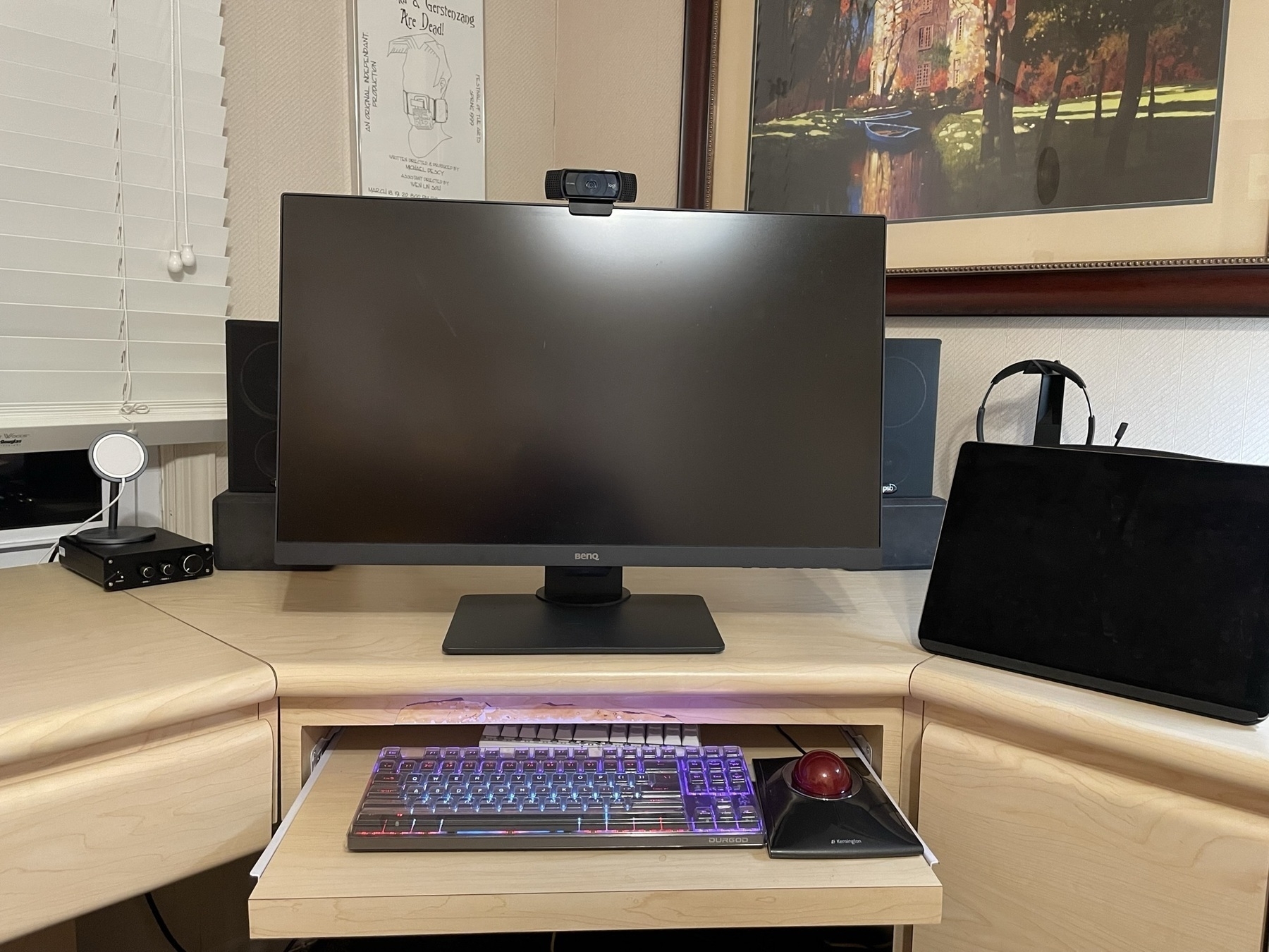
Late tonight I reconfigured my desk setup for the umpteenth time. The main reason is that my last setup revision, which moved my monitor forward and my keyboard and mouse to a pull-out drawer under the desk, left my headphone and stereo amps in a no-mans-land behind my monitor, completely out of reach.

My desk is strange, and I wish I had one or two normal, five-foot-wide rectangular desks in its place. I have a corner desk that is not nearly as wide as I would like, though it does connect to desktop areas of varying utility along each side. (Imagine a V-shaped desk, where the main seating area is at the apex of the V, with a secondary desk area on the left, and a cabinet on the right, all connected together.)

I am planning to add a second monitor to the main area that I use for work. Unfortunately, it is unclear how exactly it would fit comfortably there, but I went ahead and ordered a new monitor anyway. (Both monitors are/will be 4K 27-inch displays.) My plan is to orient it vertically (with a downward tilt so I can read it) to the right of my current monitor. It may look a little weird, and be less useful for me to use on that side, but I don’t have anywhere else to put it.

Oddly, for this setup I moved my work laptop onto the floor. It’s actually on a little five-inch-high shelf I made right that sits on on the floor under my desk, far enough from my chair that I cannot kick it. Fortunately, you can’t see it or the multitude of wires connecting to every side of it, unless you crawl under the desk. I’m sure I will have to do that occasionally to reboot the laptop, but that won’t be too often, and has always been a pain for me to do anyway.

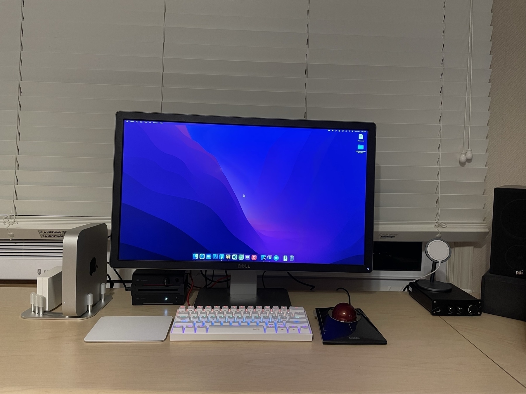
I moved my headphone dac/amp stack right next to my Mac mini, which has its own setup to the left of my work computer’s monitor-and-keyboard setup. Because the path for headphone cords no longer crosses over my keyboard or mouse at either computer, I will be able use it again. (I haven’t been able to use it since the last revision to my desk setup.) I really look forward to that.

My two laptops (one a very old MacBook Pro, the other a relatively new Dell running Windows 11) are now in a drawer. I removed their chargers from their power strip, and they now reside neatly in labeled bags next to the laptops. I just don’t use them that much since I got my Mac mini, and I never plug them into a monitor. It just makes sense for me now to consider them as portable, and to pull them out when I need them and hide them the rest of the time.

Also as part of this revision, I put my high-speed Epson scanner away in a cabinet because I never use it. It’s s shame, because it is very fast. Unfortunately, it isn’t that useful for my scanning needs because I don’t have stacks of letter-size papers to scan. Instead, I usually have a bunch of irregularly sized papers that require a flatbed banner (which I have as part of my multifunction printer).

Now that I am done, I am happy again with it. Everything looks tidy and functional. Adding the second monitor to the work setup will be a challenge for another night.

I am grateful to the Micro.blog team and community for the (relatively) new plugins system. The stats and search plugins are blowing my mind right now. They are exactly what I have wanted from “day 1” and did not know how to create myself. Thanks @amit and @manton and to others who contributed.

Double Commander

I am on a mission to replace Far Manager, which is a Windows file manager that I really love, and have used for over a year. Far Manager is a text mode file manager that has been in development since the 1990s. It is a lot like Norton Commander, which I used briefly in my DOS days. I like how fast the UI is, how easy it is to navigate the filesystem, and also how easy it is to read the file and folder names in text mode.

Unfortunately, it has a few drawbacks that have been driving me crazy. First, opening Visual Studio Code from it, which I have to do all the time, will often mess up the UI and require a restart. Second, the keyboard shortcuts—many of which I have memorized—are bonkers. The left and right shift keys act as completely different modifiers, and the left and right control keys act the same way. This is not a problem for my standard ANSI keyboard, but I am trying to move to an ortholinear keyboard which doesn’t have two shift keys or two control keys, so some of the functionality I rely on is inaccessible.

Today I found another orthodox (two-panel) file manager that runs on Windows, has a full graphical UI, and is very, very customizable. It’s called Double Commander. Life Far Manager, it is free, and it has the two-pane interface I love. Unlike Far Manager, you can customize nearly every part of the user interface, including all the keyboard shortcuts. I was able to pare down the default toolbars to a minimum, color the interface to have white text on a navy blue background, and learn the few keyboard shortcuts I need to know without any trouble. Prior to learning about it today, I thought I had tried all the orthodox file managers for Windows. Double Commander is my favorite of the bunch.

🎉 Happy fifth anniversary to the Micro.blog community! I am very grateful that it exists.

How I try not to be rude when accidentally talking over someone at work

When I cut somebody off in an online meeting, I now apologize to the person I spoke over and say “I’m just excited” about whatever it is we are talking about. It may be a lie (because how exciting is my job, anyway?) but I think it is usually appreciated. After I do this, I shut up and listen.

I almost never mean to cut people off in meetings, by the way. I find it hard, especially during conference calls or WebEx meetings, to know who should talk when a question is thrown out to all attendees at once. Sometimes I start talking at the same time someone else does, and I think we both feel embarrassed about it.

Why do Americans work so hard?

Two reasons:

  1. Culture. The Puritan work ethic is one of the foundations of our culture, and has been since colonial times. Work is righteous and cleansing to the soul. Of course this is nonsensical, but it is baked into the culture. People are brought up hearing that our ancestors pulled themselves up by their bootstraps (itself a nonsensical idea if you think about it), and that when times get tough we should do the same rather than reach out to others for assistance. This idea can be termed rugged individualism.
  2. Economic uncertainty. The US have a poor social safety net, and about half of all voters consistently vote to strip more and more of it away. I have it pretty good, economically speaking, but I feel like I am only a few months away from losing my house if my wife or I lose our jobs and can’t replace it incomes and our health insurance right away. Also, income inequality is such that there is always someone vastly richer than you to compare yourself to. That drives a lot of people to work harder, even though a lot of the very rich inherited their wealth (seed money at least) and/or the connections needed to grow it.

Breaking things down

I have tons of different “extra-curricular” projects right now, mostly for my job, but also to satisfy my own desire to build, develop, and share. I have systems projects, programming projects, presentations, and a white paper to write. This is on top of my normal job and home life, and my desire to read a book or play Metroid Dread sometimes, too. I have started to break down each project into discrete tasks, and plan for only the next couple. I know my deadlines, but I don’t have hours and hours in a row to work on any of these things. I think this is the way forward. I don’t want to stress myself out when everything becomes due.

Background music and Endel

Sometimes when I’m working, I want music playing, but I don’t really know what I want to listen to, and I don’t have the patience to think about it. In these situations, I have tried listening to classical music, jazz, and lo-fi (hip-hop/trip-hop, etc.). Over the past week, I gave Endel an honest try, too.

While I enjoy classical music in a live setting, I don’t like listening to it in my headphones. Its wide dynamic range makes it so that I can’t hear some sections of it, and other sections are too loud. That doesn’t work for me; I want something that is not too loud, but is completely audible, all the time.

Jazz (especially classic jazz) was what I listened to almost exclusively during my senior year of college. It got me through reading and writing hundreds and hundreds of pages of text. However, I find my engagement with jazz to be all over the map. I love some of it and I hate some of it, and the kind of jazz you can just have on, not listening to—smooth jazz, I suppose—is just bad. All in all, I find jazz too distracting to listen to while I work, unless I listen to a single album that I already know and love.

Lo-fi hip hop is my favorite background music at this point. I appreciate its nearly constant beat, somewhat consistent tempos, and there appears to be a never-ending supply of it. My wife hates when I play it in the house when I am doing chores or writing, though, which means I can only really listen to it via headphones when I’m around her. It works great on my headphones while I read on my iPad, or through my loudspeakers when I work.

Over the past two weeks, I tried to get into Endel, which offers an AI-based soundscape that constantly changes and continually evolves as you listen to it. I like the idea a lot more than the reality of it, though I think it has a lot to do with my tinnitus. Endel is extremely treble-heavy and bass-light (really, there is no bass at all), and only one of its scenarios, Focus, has a beat. I would not describe the sounds as shrill, but they aggravate my tinnitus instead of helping me ignore it. Last week, I listened to Endel exclusively through headphones (my B&O H9s and my AirPods) while I did chores like the dishes and laundry. This morning, now that I am back at work, I tried listening to the Focus soundscape for a few hours through my loudspeakers. It drove my wife and both my kids absolutely bananas. Each of them yelled at me to stop playing it, even though it was not playing loudly, and they were on a different level of the house. After that experience, I think I will not be buying an Endel lifetime subscription.

Tomorrow I plan to listen to Lofi Girl for much of my workday. That is the best bet for me, when I can’t make up my mind about music and need to focus on my work more than what I am listening to.

You can change the Windows 10 mouse cursor color?!

I discovered today that Windows 10 lets you change your mouse cursor’s color as well as its size. You have been able to change the mouse cursor set to a different one since Windows 3, I think, which would allow you to switch the color in a different, less flexible way. This feature is different.

I now have a slightly larger, bright-yellow-with-black-outline mouse cursor on my huge 4K monitor. It is much easier to spot when I am returning to my desk after a break. If only Microsoft implemented the “shake that mouse and the cursor gets bigger” feature from macOS.

I never would have predicted that in 2021 I would be using a text-mode file manager from the 1990s, a command-line based to-do list program, and, at least sometimes (by choice!), the Vim text editor.

Today I was very happy to find a command line todo.txt app that works on Windows.

There is no perfect template—just pick one

I stayed up late last night drafting a new, Hugo-driven version of one of my websites. I went from having nothing at all built to having about one third of the site done in a couple hours. The result, I think, will be more plain (and maybe more ugly) than the existing site, but it will be less janky on mobile devices.

I sank a lot of time over the past week looking for a Hugo theme that is perfect for my needs, but I couldn’t find one. For the sake of achieving my simple goal of refreshing my tiny websites, I gave up the goal of visual perfection, and am driving forward with a theme that I think is OK that works well enough for me.

From my perspective, I want my site to be easier to maintain and add content. That is more important to me than having a site that looks really slick. My old websites don’t look slick anymore, anyway: No one is fooled by outdated HTML templates into thinking that my very niche apps are developed by a huge, sophisticated software corporation.

The organizational rabbit hole

This is a short, short version of what happened to me over the past week when I decided to get organized.

  1. Form a desire to organize my project files differently.
  2. Discover the Johnny Decimal system.
  3. Create a taxonomy for my files in a text file.
  4. Start writing PowerShell script to switch folders based on the Johnny Decimal number
  5. Start writing a PowerShell script to index all the Johnny Decimal numbers in my folder tree
  6. Think about working with files from the command line more often
  7. Install Midnight Commander for a command line file manager
  8. Learn a lot of Midnight Commander shortcuts and customizations
  9. Learn about Far Manager, which is a lot like Midnight Commander but works much better on Windows
  10. Run into keyboard shortcut conflicts with Windows Terminal
  11. Learn about assigning and removing keyboard shortcuts in Windows Terminal
  12. Start thinking about using todo.txt from the Windows Terminal, because my TaskPaper file has been too big for months and is awful to work with
  13. Tried to find a todo.txt command line app for Windows that works on my machine
  14. Thought about writing my own todo.txt command line app using an old C# library I created

And…I still haven’t organized anything yet. 😅

The menu key

I was thinking about creating a training presentation to help my coworkers with keyboards shortcuts, but was dismayed to see that our Lenovo laptop keyboards (which I never use, because I work from home and use external peripherals) don’t even have a menu key. Someone decided that Print Screen was more important, which may even be true, but it doesn’t help me make a good presentation for my coworkers. The menu key alternative, Shift+F10 is going to be a very hard sell, especially because F10 on the laptop requires the Fn key to be pressed, too.

I have gone from someone who did not use the menu key on my keyboard for 20+ years (since it was invented in the 1990s) to someone who can’t live without it (on my Windows at least). I made it a point to start using it a few months ago, and now I use it constantly. I recommend that all Windows users with an ANSI or ISO keyboard layout check it out. That key is positioned right underneath your thumb when you use the arrow keys.

Alt+F4

I have been using AutoHotKey for many years, and I never thought until today to map Windows+Q to quit the active app and close the active window. That creates something very similar to Mac’s Command+Q shortcut to Windows.

The default Windows keyboard shortcut for quitting an app is Alt+F4, which is a two hand operation for me. Note that in AutoHotKey, you don’t even need to send that key command; you can use the WinClose function instead:

#q::  
WinClose, A  
Return  

One of the best things Apple has ever done with their support of keyboard shortcuts was to pretend that function keys (F1 through F12) don’t exist.

Friday is time for Inbox Zero

I have been an Inbox Zero guy since the early 2000s. Now I can’t keep up with my email; it comes in too fast, and I actually have work to do that demands my attention. Consequently, my Inbox is almost never empty.

Now, mostly on Fridays, I just select all my Inbox emails (Ctrl-A) and move them to my Archive folder (Ctrl-Shift-1 thanks to an Outlook Quick Step I created), whether I have processed them or not. The emails aren’t deleted, they are just out of my Inbox, and that’s good enough.

I am investing some time trying to see if I could implement a Johnny Decimal system for my files at work. Some of the constraints are tricky to deal with, but the general idea of it dovetails into what I have been doing for organization, and takes it one or two steps further.

Effective Presentations

When it comes to creating effective PowerPoint presentations for work, my reach still exceeds my grasp.

I know a lot of important concepts, including the following:

  1. The slide deck is a visual aid, not the presentation
  2. Focus on one idea per slide
  3. Focus on very few visual elements/focus points per slide (e.g., five or six, maximum)
  4. Light text on a dark background is easier on the eye

Unfortunately, when I try to apply those ideas, I feel like I’m not getting anywhere. All of my slides look completely conventional: no better than those I created many years ago. I think they are effective, but they are ugly and boring. It does not help that I have to present on topics that are dry and technical in nature. I also feel hamstrung by my company’s PowerPoint template, which is quite busy, focuses attention on the wrong areas of the slide (i.e., the title and the footer), and has (almost completely) black text on a white background.

I think I need to invent a visual style that I can get away with on at least some of my slides:

  • Full-bleed images that cover the entire slide, and obviate the need for titles or footers on my slides.
  • Text boxes that float over the images, or captions that fill in the top title area that is already part of our PowerPoint template.

I just hope, if I do these things, my slides won’t end up looking like tired internet memes.

Mermaid 🧜‍♀️ for flowcharts

Tonight I learned about Mermaid, which is a plaintext markup language and renderer for creating flowcharts and other kinds of diagrams.

I want to make flowcharts quickly for my technical projects at work, but i don’t have Visio, and I hate fiddling with a GUI to line up shapes and worry about arrow lengths and so on. The way my mind works, I just want to type out what I want and have software figure out how to lay it out for me. I don’t care that much how it looks, as long as it is simple and makes sense.

Mermaid’s plaintext premise is really cool, and the syntax is flexible enough to not be awful. It is way more flexible than the examples on The Mermaid website originally led me to believe. You can name each shape whatever you like (not just single letter identifiers) and you can define the content (shapes) and relationships (arrows) separately if you want to. The only thing that stinks is that you have to manually insert html break tags (<br/>) for line breaks, because there is no word wrap.

I still need to figure out what the best renderer is for me. The Mermaid Live Editor does not produce usable charts on my work machine’s web browser (the new Edge) for some reason. Typora seems like it will do for now.